I (@rrousselGit) am sadly unable to maintain flutter_portal at the moment due to a lack of time, and would like to find
a new maintainer.
If you are interested in taking over flutter_portal, open an issue saying that you are interested or reach out to me at darky12s@gmail.com.
Thanks!
A common use-case for UIs is to show "overlays". They come in all shapes and forms:
- tooltips
- contextual menus,
- dialogs
- etc
In Flutter, these are usually shown by using Overlay/OverlayEntry. The problem is, OverlayEntry is not a widget, and is manipulated using imperative code.
This has a few issues:
-
Implementing a custom tooltip/contextual menu is difficult. It is not trivial to align the tooltip/menu next to a widget.
-
When our application is killed by the OS, the state of our modals are not restored. There are some way to to that, but it is signicantly harder than using
RestorableProperty. -
It causes issues with
Themeand other context-based variables. For some confusing reasons, it is possible that the theme obtained byTheme.ofinside dialogs/menus is different from the theme of the widget that showed these overlays.
Flutter_portal tries to fix all of these:
-
It has built-in support for aligning an overlay next to a UI component. You can create a custom contextual menu from scratch in a few lines of code.
-
Overlays are now showed declaratively, by inserting them in the widget tree. This makes showing an overlay as simple as doing a
setState– which combines nicely withRestorableProperty. -
The overlay has access to the same Theme and the different providers than the widget that showed the overlay.
First, you will need to add portal to your pubspec.yaml:
dependencies:
  flutter:
    sdk: flutter
  flutter_portal: ^0.4.0
Then, run flutter packages get in your terminal.
Make sure to check-out the examples folder for examples on how to use flutter_portal.
| Contextual menu | Onboarding view |
|---|---|
 |
 |
Add the Portal widget
Before doing anything, you must insert the Portal widget in your widget tree. This widget enabled flutter_portal in your project.
You can place this Portal above MaterialApp or near the root of a route:
Portal(
  child: MaterialApp(
    ...
  )
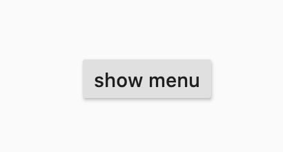
)In this example, we will see how we can use flutter_portal to show a menu
after clicking on a RaisedButton.
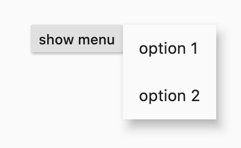
The menu will be aligned to the left of our button.
First, we need to create a StatefulWidget that renders our RaisedButton:
class MenuExample extends StatefulWidget {
  @override
  _MenuExampleState createState() => _MenuExampleState();
}

class _MenuExampleState extends State<MenuExample> {
  @override
  Widget build(BuildContext context) {
    return Scaffold(
      body: Center(
        child: RaisedButton(
          onPressed: () {},
          child: Text('show menu'),
        ),
      ),
    );
  }
}
Then, we need to insert our PortalEntry in the widget tree.
We want our contextual menu to render right next to our RaisedButton.
As such, our PortalEntry should be the parent of RaisedButton like so:
Center(
  child: PortalEntry(
    visible: // TODO
    portal: // TODO
    child: RaisedButton(
      ...
    ),
  ),
)
We can pass our menu to PortalEntry:
PortalEntry(
  visible: true,
  portal: Material(
    elevation: 8,
    child: IntrinsicWidth(
      child: Column(
        mainAxisSize: MainAxisSize.min,
        children: [
          ListTile(title: Text('option 1')),
          ListTile(title: Text('option 2')),
        ],
      ),
    ),
  ),
  child: RaisedButton(...),
)
At this stage, you may notice two things:
- our menu is full-screen
- our menu is always visible (because
visibleis true)
Let's fix the full-screen issue first and change our code so that our
menu renders on the right of our RaisedButton.
To align our menu around our button, we can specify the childAnchor and
portalAnchor parameters:
PortalEntry(
  visible: true,
  portalAnchor: Alignment.topLeft,
  childAnchor: Alignment.topRight,
  portal: Material(...),
  child: RaisedButton(...),
)
What this code means is, this will align the top-left of our menu with the
top-right or the RaisedButton.
With this, our menu is no-longer full-screen and is now located to the right
of our button.
Finally, we can update our code such that the menu show only when clicking on the button.
To do that, we need to declare a new boolean inside our StatefulWidget,
that says whether the menu is open or not:
class _MenuExampleState extends State<MenuExample> {
  bool isMenuOpen = false;
  ...
}
We then pass this isMenuOpen variable to our PortalEntry:
PortalEntry(
  visible: isMenuOpen,
  ...
)
Then, inside the onPressed callback of our RaisedButton, we can
update this isMenuOpen variable:
RaisedButton(
  onPressed: () {
    setState(() {
      isMenuOpen = true;
    });
  },
  child: Text('show menu'),
),
One final step is to close the menu when the user clicks randomly outside of the menu.
This can be implemented with a second PortalEntry combined with [GestureDetector] like so:
Center(
  child: PortalEntry(
    visible: isMenuOpen,
    portal: GestureDetector(
      behavior: HitTestBehavior.opaque,
      onTap: () {
        setState(() {
          isMenuOpen = false;
        });
      },
    ),
    child: PortalEntry(
      // our previous PortalEntry
      portal: Material(...)
      child: RaisedButton(...),
    ),
  ),
)There are a few concepts that are useful to fully understand when using
flutter_portal. That is especially true if you want to support custom use
cases, which is easily possible with the abstract API provided.
In the following, each of the abstract concepts you need to understand are
explained on a high level. You will find them both in class names (e.g. the
Portal widget or the PortalTarget widget as well as in parameter names).
A portal (or the portal if you only have one) is the space used for doing all of the portal work. On a low level, this means that you have one widget that allows its subtree to place targets and followers that are connected.
The portal also defines the area (rectangle bounds) that are available to any followers to be rendered onto the screen.
In detail, you might wrap your whole MaterialApp in a single Portal widget,
which would mean that you can use the whole area of your app to render followers
attached to targets that are children of the Portal widget.
A target is any place within a portal that can be followed by a follower. This allows you to attach whatever you want to overlay to a specific place in your UI, no matter where it moves dynamically.
On a low level, this means that you wrap the part of your UI that you want to
follow in a PortalTarget widget and configure it.
Imagine you want to display tooltips when an avatar is hovered in your app. In that case, the avatar would be the portal target and could be used to anchor the tooltip that is overlayed.
Another example would be a dropdown menu. The widget that shows the current selection is the target and when tapping on it, the dropdown options would be overlayed through the portal as the follower.
A follower can only be used in combination with a target. You can use it for anything that you want to overlay on top of your UI, attached to a target.
Specifically, this means that you can pass one follower to every
PortalTarget, which will be displayed above your UI within the portal when
you specify so.
If you wanted to display an autocomplete text field using flutter_portal,
you would want to follow the text field to overlay your autocomplete
suggestions. The widget for the autocomplete suggestions would be the portal
follower in that case.
Anchors define the layout connection between targets and followers. In general, anchors are implemented as an abstract API that provides all the information necessary to support any positioning you want. That means that anchors can be defined based on the attributes of the associated portal, target, and follower.
There are a few anchors that are implemented by default, e.g. Aligned or
Filled.


