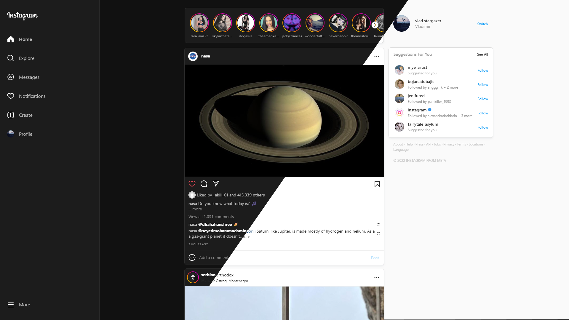
The UserCSS will add the look and feel of a dark mode on Instagram.
This will restore the Instagram layout to a normal state before the complete disaster with the new layout. The code is incredibly low quality and the DOM looks like a toddler wrote the update for the new Instagram layout. While inspecting the DOM, I’ve found a lot of garbage HTML nodes, hidden form elements that have no purpose, and multiple empty divs’ that have no purpose and are not being used.
Make sure you set the app appearance to "Light" by turning on Instagram's "Dark mode" in the bottom left corner. Click on the hamburger menu at the bottom left corner, select "Switch appearance" from the options, and then disable the "Dark mode" by clicking on the toggle for the "Dark mode" option.
There are 3 options from which you can choose.
- Dark theme
- Light theme
- System theme
Sets the theme to "Dark" indefinitely. It will use the "Dark theme" all the time.
Sets the theme to "Light" indefinitely. It will use the "Light theme" all the time.
Sets the theme to the system default theme. What that means is that if your system uses the "Dark" theme, then the "Dark theme" will be applied, and vice versa. This is an ideal option if you want to make the theme more dynamic, to use the “Light theme” during the day, and use the “Dark theme” during the night.

